The purpose of this comparison is was to examine the different ways that the same data could be presented. In these 4 maps, the numbers are the same. As we can see, the way the numbers are categorized have a noticeable affect on the appearance of the data. Depending on the mapmakers intentions and biases, they may choose to present information in a way that benefits themselves while not providing a very objective representation of the numbers.
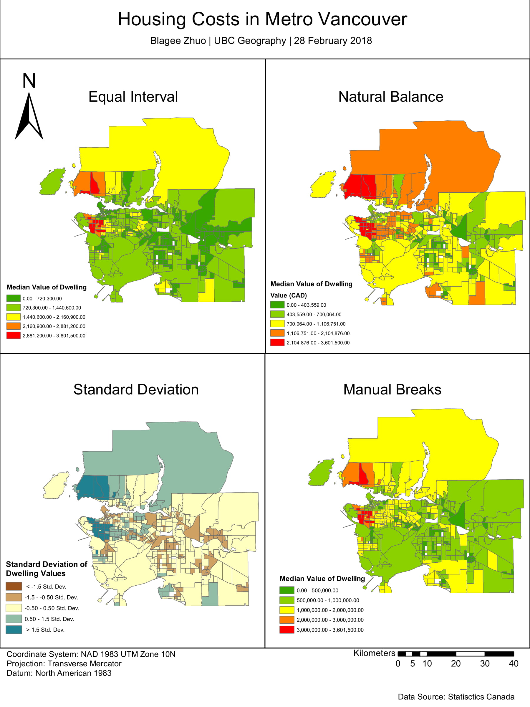
Assessed data in using various classifications in order to gain insight on the different ways maps can be manipulated to convey certain messages.