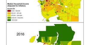
For this project, our group proposed that we examine immigration patterns in Metro Vancouver between 2001 and 2016. To do this, we would be using income and immigration data from the Canadian Censuses of 2001 and 2016 and analyzing data in a search for a possible relationship between money and the movement of people. We created maps comparing median household income in 2001 and 2016, and maps comparing breakdowns of the 5 most prominent countries of origin for immigrants in the same years. We then compared the two sets of maps to each other, to examine the two different datasets.
Work in this project was divided up relatively evenly. Two of us worked on producing maps and writing up the methodology while the others did the majority of the actual written report. The writers offered suggestions on how to improve the maps, and the mapmakers offered their ideas on what should be written down. Overall, it was a very equal project in terms of workload. We settled on dates to meet up and work together, which was usually during out lab sections, and managed to complete most of the work during this time. We communicated almost entirely through Facebook Messenger, and we communicated quite effectively. Everyone was very supportive and quick to come to each other's aid.
Of the facts that we learned from the project itself, the most interesting immigration fact was probably learning the 5 largest immigrant populations in Canada. India and China were expected, but I was surprised to learn that the Philippines, Iran, and Pakistan were also in the top 5. I had expected countries like Korea or Ukraine. We also learned some interesting new GIS functions, namely the use of graphs and other visual displays of data on top of the existing map. Discovering this function was actually quite fun and enlightening. We also were able to practice and apply many GIS skills that were learned during the course, which was very rewarding. Regarding teamwork, the key to our success was assigning work based on our personal strengths and trusting each other to complete our work. This mutual trust allows for us to focus on our own tasks and complete them well, as well as being able to openly discuss areas where improvements could be made. The most difficult aspect to group work like this was definitely sharing our data. Luckily, there are many technologies such as Google Drive that allow us to share files very easily. Transferring .mxd files was a chore because we would have to transfer all the data, which usually meant a large folder. Even after all that, people would still have to reconnect the individual folders that contained the data to show the layers in ArcGIS. Because of this hassle, I definitely recommend working on one computer to make a map, rather than trying to move around. The only real issue we encountered regarding data was choosing which sources we wanted to take from. Ultimately it was a group decision and we would all discuss and agree on which data sources are most appropriate for our purposes.
I am very grateful to have had the opportunity to work with the fantastic group members that I had, and I can honestly say this was a very fulfilling project to complete.
Learning Significance